<categories font='Verdana' fontSize='10' fontColor='000000'
verticalLineColor='' verticalLineThickness='1' verticalLineAlpha='100'>
<category Name='2004' xIndex='1' showLine='1'/>
<category Name='Feb' xIndex='31' showLine='1'/>
<category Name='March' xIndex='59' showLine='1'/>
<category Name='Split' xIndex='44' showLine='1'/>
</categories>
<data>
<set open='92.57' high='93.79' low='92.45' close='93.39' xIndex='1'
/>
<set open='92.4' high='92.7' low='91.42' close='92.45' xIndex='2' />
<set open='92.6' high='92.69' low='90.88' close='91.82' xIndex='3'/>
<set open='92' high='93.38' low='91.68' close='93.3' xIndex='4'/>
<set open='92' high='92.98' low='91.15' close='91.21' xIndex='5'/>
<!-- More Data Here -->
<set open='93.23' high='93.25' low='92.67' close='93.14' xIndex='60'/>
<set open='93' high='93.38' low='92.5' close='92.73' xIndex='61'/>
<set open='93.85' high='93.87' low='92.85' close='93.4' xIndex='62'/>
</data>
<trendLines>
<line startValue='89.5' endValue='98' color='FF0000' displayvalue='Roll.
Avg.' thickness='2' alpha='100' isTrendZone='0'/>
</trendLines>
</graph>
As you can see in the above XML document, there are basically four sections of data:
- <graph> section - This section helps you set the various visual attributes for the chart apart from a few other numerical attributes.
- <categories> section - This section of data lets you create the textual categories to be displayed on the chart. It also helps you configure the category vertical lines and their formatting.
- <data> section - This is the actual section where you define your financial data.
- <trendLines> section - This section helps you set the trend lines on the chart.
Let's now see each of them in detail.
<graph>
Attributes of the <graph> element help you set the visual looks of the chart and a few functional parameters. Here we'll group those attributes by their parent chart element and then look at it.
Graph Properties
- bgColor="HexColorCode" : This attribute helps you set the background color of the chart.
- bgAlpha="NumericalValue(0-100)" : This attribute helps you set the alpha (transparency) of the graph.
Canvas Properties
- canvasBgColor="HexColorCode" : This attribute helps you set the background color of the canvas.
- canvasBgAlpha="NumericalValue(0-100)" : This attribute helps you set the alpha (transparency) of the canvas.
- canvasBorderColor="HexColorCode" : This attribute helps you set the border color of the canvas.
- canvasBorderThickness="NumericalValue(0-100)" : This attribute helps you set the border thickness (in pixels) of the canvas.
Chart Numerical Limits
- xAxisMinValue="value" : This attribute determines the lower limit of x-axis.
- xAxisMaxValue="value": This attribute determines the upper limit of x-axis.
- yAxisMinValue="value": This attribute determines the lower limit of y-axis.
- yAxisMaxValue="value" : This
attribute determines the upper limit of y-axis.
If you don't specify any of the above 4 values, it is automatically calculated by FusionCharts based on the data provided by you. - overRideLimitCalc="1/0": When you provide data and the upper and lower limits to FusionCharts, FusionCharts (while rendering) checks whether the upper and lower limits are correctly provided - that is it checks whether all the data values fall within the specified range. Sometimes, this process takes a little extra time when you have a large amount of data. If in that case you don't want FusionCharts to cross check the limits explicitly provided by you, you can set this attribute value to 1 and then FusionCharts won't delve into the process of checking thus saving that extra bit of time required.
Bars or Candles
- showAsBars="1/0": Whether to show candles or bars on the chart.
Divisional Lines (Horizontal)
- numdivlines="NumericalValue" : This attribute sets the number of divisional lines to be drawn.
- divlinecolor="HexColorCode" : The color of grid divisional line.
- divLineThickness="NumericalValue" : Thickness (in pixels) of the grid divisional line.
- divLineAlpha="NumericalValue0-100" : Alpha (transparency) of the grid divisional line.
- showDivLineValue="1/0" : Option to show/hide the textual value of the divisional line.
- showAlternateHGridColor="1/0" : Option on whether to show alternate colored horizontal grid bands.
- alternateHGridColor="HexColorCode" : Color of the alternate horizontal grid bands.
- alternateHGridAlpha="NumericalValue0-100"
: Alpha (transparency) of the alternate horizontal grid bands.
Divisional Lines (Vertical)
- numVDivLines="NumericalValue" : Sets the number of vertical divisional lines to be drawn.
- VDivlinecolor="HexColorCode" : Color of vertical grid divisional line.
- VDivLineThickness="NumericalValue" : Thickness (in pixels) of the line
- VDivLineAlpha="NumericalValue0-100" : Alpha (transparency) of the line.
- showAlternateVGridColor="1/0" : Option on whether to show alternate colored vertical grid bands.
- alternateVGridColor="HexColorCode" : Color of the alternate vertical grid bands.
- alternateVGridAlpha="NumericalValue0-100" : Alpha (transparency) of the alternate vertical grid bands.
General Properties
- caption="String" : Caption of the chart
- subCaption="String" : Sub-caption of the chart
- shownames="1/0" : Option whether to show/hide the category names.
- showLimits="1/0" : Option whether to show/hide the chart limit textboxes.
- rotateNames="1/0" : Configuration that sets whether the category name text boxes would be rotated or not.
Number Formatting Options
- numberPrefix="$" : Using this attribute, you could add prefix to all the numbers visible on the graph. For example, to represent all dollars figure on the chart, you could specify this attribute to ' $' to show like $40000, $50000.
- numberSuffix="p.a" : Using
this attribute, you could add prefix to all the numbers visible on the
graph. For example, to represent all figure quantified as per annum
on the chart, you could specify this attribute to ' /a' to show like
40000/a, 50000/a.
To use special characters for numberPrefix or numberSuffix, you'll need to URL Encode them. That is, suppose you wish to have numberSuffix as % (like 30%), you'll need to specify it as under:
numberSuffix='%25' - formatNumber="1/0" : This configuration determines whether the numbers displayed on the graph will be formatted using commas, e.g., 40,000 if formatNumber='1' and 40000 if formatNumber='0 '
- formatNumberScale="1/0" : Configuration whether to add K (thousands) and M (millions) to a number after truncating and rounding it - e.g., if formatNumberScale is set to 1, 10434 would become 1.04K (with decimalPrecision set to 2 places). Same with numbers in millions - a M will added at the end.
- decimalSeparator="." : This option helps you specify the character to be used as the decimal separator in a number.
- thousandSeparator="," : This option helps you specify the character to be used as the thousands separator in a number.
- decimalPrecision="2" : Number of decimal places to which all numbers on the chart would be rounded to.
- divLineDecimalPrecision="2": Number of decimal places to which all divisional line (horizontal) values on the chart would be rounded to.
- limitsDecimalPrecision="2" : Number of decimal places to which upper and lower limit values on the chart would be rounded to.
Hover Caption Properties
- showhovercap="1/0" : Option whether to show/hide hover caption box.
- hoverCapBgColor="HexColorCode" : Background color of the hover caption box.
- hoverCapBorderColor="HexColorCode" : Border color of the hover caption box.
- hoverCapSepChar="Char" : The character specified as the value of this attribute separates the name and value displayed in the hover caption box.
Font Properties
- baseFont="FontName" : This attribute sets the base font family of the graph font which lies on the canvas i.e., all the values and the names in the graph which lie on the canvas will be displayed using the font name provided here.
- baseFontSize="FontSize" : This attribute sets the base font size of the graph i.e., all the values and the names in the graph which lie on the canvas will be displayed using the font size provided here.
- baseFontColor="HexColorCode" : This attribute sets the base font color of the graph i.e., all the values and the names in the graph which lie on the canvas will be displayed using the font color provided here.
- outCnvBaseFont = "FontName" : This attribute sets the base font family of the graph font which lies outside the canvas i.e., all the values and the names in the graph which lie outside the canvas will be displayed using the font name provided here.
- outCnvBaseFontSize="FontSize" : This attribute sets the base font size of the graph i.e., all the values and the names in the graph which lie outside the canvas will be displayed using the font size provided here.
- outCnvBaseFontColor="HexColorCode": This attribute sets the base font color of the graph i.e., all the values and the names in the graph which lie outside the canvas will be displayed using the font color provided here.
Candle Properties
- candleWidth="NumericalValue" (Optional): If you explicitly wish to define the width of each candle in the chart, you can use this attribute. However, this attribute is optional in the sense that FusionCharts would automatically calculate the best fit value for the candle width.
- bearBorderColor="HexColor": Border Color for a bear candle.
- bearFillColor="HexColor": Fill Color for a bear candle.
- bullBorderColor="HexColor": Border Color for a bull candle.
- bullFillColor="HexColor": Fill Color for a bull candle.
<categories> attributes and elements
Attributes and child-elements of the <category> elements help you create the x-axis labels on the chart. They also help you create the vertical category lines on the chart and configure their visual properties.
The <categories> element has the following attributes:
- font='FontName' : This attribute helps you set the font face for the x-axis labels in specific.
- fontSize='FontSize' : This attribute helps you set the font size for the x-axis labels in specific.
- fontColor='HexColor' : This attribute helps you set the font color for the x-axis labels in specific.
- verticalLineColor='HexColor' : This attribute helps you set the color of the category line (i.e., the vertical line drawn through the entire span of the canvas just above the category name)
- verticalLineThickness='NumericalValue' : This attribute helps you set the thickness of the category line in pixels.
- verticalLineAlpha='NumericalValue0-100' : This attribute helps you set the alpha (transparency) of the category line
For each category name, you'll need to define a <category> element
as under:
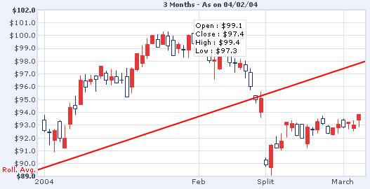
<category Name='Split' xIndex='44' showLine='1'/>
The <category> element can have the following attributes:
- name='String': x-axis label to be displayed.
- xIndex='NumericalValue': x-axis position where the category name is to be displayed. In the candlestick chart, the x-axis is also numbered - i.e., it has an upper limit and a lower limit. For example, when you're plotting a chart to show the data for a month, the lower limit of x-axis would be 1 and the upper limit 31. So, when you need to render a category label for the 15th day of the month say "Mid-month", you'll have specify xIndex as 15 for that <category>.
- showLine='1/0' : Option to whether show or hide the line just above this particular category name.
<data> child elements
The actual data of the chart comes under the <data>
element. For each data item, you've to specify a <set>
element as under:
<set open='92' high='93.38' low='91.68' close='93.3'
xIndex='4' link='Detail.asp?day=32'/>
The <set> element can have the following attributes:
- open="NumericalValue" : This attribute determines the open value for the data set. It is compulsory to provide this value.
- high="NumericalValue" : This attribute determines the high value for the data set. It is compulsory to provide this value.
- low ="NumericalValue" : This attribute determines the low value for the data set. It is compulsory to provide this value.
- close ="NumericalValue" : This attribute determines the close value for the data set. It is compulsory to provide this value.
- borderColor="HexColorCode" [Optional]: This attribute lets you change the border color of particular candle on the chart. All the candles on the chart follow the color code as specified in bearBorderColor and bullBorderColor attributes of the <graph> element. However, if in some case you want to highlight one particular candle by changing it's color, you can use this option.
- color="HexColorCode" [Optional]: Similar to the border color (previous attribute), this attribute lets you set the fill color of a particular candle selectively.
- xIndex="NumericalValue" [Optional]: x-axis position of the candle. In the candlestick chart, the x-axis is also numbered - i.e., it has an upper limit and a lower limit. For example, when you're plotting a chart to show the data for a month, the lower limit of x-axis would be 1 and the upper limit 31. So, when you're providing data for 15th day, you need to mention xIndex as 15. However, if you do not provide x-index for any of the <set> elements, FusionCharts will auto number them for you starting from 1.
- link="link" [Optional]: Sets the link for a particular candle
<trendLines>
Using the <trendLines>
element (and child elements), you can define trend lines on the charts.
Trend lines are the horizontal lines spanning the chart canvas that aid
in interpretation of data with respect to some previous pre-determined
figure. For each trend line on the chart, you need to define a <line>
element as under:
<line startValue='89.5' endValue='98' color='FF0000'
displayvalue='Roll. Avg.' thickness='2' alpha='100' isTrendZone='0' showOnTop='1'/>
The <line> element can have the following attributes:
- startValue='NumericalValue': The starting y-axis value for the trendline. Say, if you want to plot a slanted trendline from value 102 to 109, the startValue would 102.
- endValue='NumericalValue': The ending y-axis value for the trendline. Say, if you want to plot a slanted trendline from value 102 to 109, the endValue would 109. If you do not specify a value for endValue, it would automatically assume the same value as startValue.
- color='HexCode' : Color of the trend line and its associated text.
- displayValue='StringValue' : If you want to display a string caption for the trend line by its side, you can use this attribute. Example: displayValue='Last Month High'. When you don't supply this attribute, it automatically takes the value of startValue.
- thickness='NumericalValue' : Thickness of the trend line
- isTrendZone='1/0': Whether the trend would display a line, or a zone (filled colored rectangle).
- showOnTop='1/0': Whether the trend line/zone would be displayed over the candles or under the candles.
- alpha='NumericalValue0-100': Alpha (transparency) of the trend line