In this section, we'll be discussing all the elements and attributes supported by the Gantt chart. A typical XML data document for the Gantt chart look as under:
<categories bgColor='333333' fontColor='99cc00' isBold='1' fontSize='14' >
<category start='1/9/2004' end='31/12/2004' name='2004' />
<category start='1/1/2005' end='31/7/2005' name='2005' />
</categories>
<categories bgColor='99cc00' bgAlpha='40' fontColor='333333' align='center' fontSize='10' isBold='1'>
<category start='1/9/2004' end='30/9/2004' name='Sep' />
<category start='1/10/2004' end='31/10/2004' name='Oct' />
<category start='1/11/2004' end='30/11/2004' name='Nov' />
<category start='1/12/2004' end='31/12/2004' name='Dec' />
<category start='1/1/2005' end='31/1/2005' name='Jan' />
<category start='1/2/2005' end='28/2/2005' name='Feb' />
<category start='1/3/2005' end='31/3/2005' name='March' />
<category start='1/4/2005' end='30/4/2005' name='Apr' />
<category start='1/5/2005' end='31/5/2005' name='May' />
<category start='1/6/2005' end='30/6/2005' name='June' />
<category start='1/7/2005' end='31/7/2005' name='July' />
</categories>
<processes positionInGrid='right' align='center' headerText='Leader' fontColor='333333' fontSize='11' isBold='1' isAnimated='1' bgColor='99cc00' headerbgColor='333333' headerFontColor='99cc00' headerFontSize='16' bgAlpha='40'>
<process Name='Ashok' id='1' />
<process Name='Pallav' id='2' />
<process Name='Akhil' id='3' />
<process Name='Sanket' id='4' />
<process Name='Srishti' id='5' />
<process Name='Kisor' id='6' />
</processes>
<dataTable fontColor='333333' fontSize='11' isBold='1' headerFontColor='000000' headerFontSize='11' >
<dataColumn headerbgColor='333333' width='150' headerfontSize='16' headerAlign='left' headerfontcolor='99cc00' bgColor='99cc00' headerText=' Team' align='left' bgAlpha='65'>
<text label=' MANAGEMENT' />
<text label=' PRODUCT MANAGER' />
<text label=' CORE DEVELOPMENT' />
<text label=' Q & A / DOC.' />
<text label=' WEB TEAM' />
<text label=' MANAGEMENT' />
</dataColumn>
</dataTable>
<tasks>
<task name='Survey' hoverText='Market Survey' processId='1' start='7/9/2004' end='10/10/2004' id='Srvy' color='99cc00' alpha='60' topPadding='19' />
<task name='Concept' hoverText= 'Develop Concept for Product' processId='1' start='25/10/2004' end='9/11/2004' id='Cpt1' color='99cc00' alpha='60' />
<task name='Concept' showName='0' hoverText= 'Develop Concept for Product' processId='2' start='25/10/2004' end='9/11/2004' id='Cpt2' color='99cc00' alpha='60' />
<task name='Design' hoverText= 'Preliminary Design' processId='2' start='12/11/2004' end='25/11/2004' id='Desn' color='99cc00' alpha='60'/>
<task name='Product Development' processId='2' start='6/12/2004' end='2/3/2005' id='PD1' color='99cc00' alpha='60'/>
<task name='Product Development' processId='3' start='6/12/2004' end='2/3/2005' id='PD2' color='99cc00' alpha='60' />
<task name='Doc Outline' hoverText='Documentation Outline' processId='2' start='6/4/2005' end='1/5/2005' id='DocOut' color='99cc00' alpha='60'/>
<task name='Alpha' hoverText='Alpha Release' processId='4' start='15/3/2005' end='2/4/2005' id='alpha' color='99cc00' alpha='60'/>
<task name='Beta' hoverText='Beta Release' processId='3' start='10/5/2005' end='2/6/2005' id='Beta' color='99cc00' alpha='60'/>
<task name='Doc.' hoverText='Documentation' processId='4' start='12/5/2005' end='29/5/2005' id='Doc' color='99cc00' alpha='60'/>
<task name='Website Design' hoverText='Website Design' processId='5' start='18/5/2005' end='22/6/2005' id='Web' color='99cc00' alpha='60'/>
<task name='Release' hoverText='Product Release' processId='6' start='5/7/2005' end='29/7/2005' id='Rls' color='99cc00' alpha='60'/>
<task name='Dvlp' hoverText='Development on Beta Feedback' processId='3' start='10/6/2005' end='1/7/2005' id='Dvlp' color='99cc00' alpha='60'/>
<task name='QA' hoverText='QA Testing' processId='4' start='9/4/2005' end='22/4/2005' id='QA1' color='99cc00' alpha='60'/>
<task name='QA2' hoverText='QA Testing-Phase 2' processId='4' start='25/6/2005' end='5/7/2005' id='QA2' color='99cc00' alpha='60'/>
</tasks>
<connectors>
<connector fromTaskId='Cpt1' toTaskId='Cpt2' color='99cc00' thickness='2' fromTaskConnectStart='1'/>
<connector fromTaskId='PD1' toTaskId='PD2' color='99cc00' thickness='2' fromTaskConnectStart='1'/>
<connector fromTaskId='PD1' toTaskId='alpha' color='99cc00' thickness='2' />
<connector fromTaskId='PD2' toTaskId='alpha' color='99cc00' thickness='2' />
<connector fromTaskId='DocOut' toTaskId='Doc' color='99cc00' thickness='2' />
<connector fromTaskId='QA1' toTaskId='beta' color='99cc00' thickness='2' />
<connector fromTaskId='Dvlp' toTaskId='QA2' color='99cc00' thickness='2' />
<connector fromTaskId='QA2' toTaskId='Rls' color='99cc00' thickness='2' />
</connectors>
<milestones>
<milestone date='29/7/2005' taskId='Rls' radius='10' color='333333' shape='Star' numSides='5' borderThickness='1'/>
<milestone date='2/3/2005' taskId='PD1' radius='10' color='333333' shape='Star' numSides='5' borderThickness='1' />
<milestone date='2/3/2005' taskId='PD2' radius='10' color='333333' shape='Star' numSides='5' borderThickness='1'/>
</milestones>
</chart>
Like all other FusionCharts chart, the Gantt charts' XML document too has <chart> as it's document element. By specifying attributes of this element, you can set the cosmetic and functional properties of the chart.
Let's first see the attributes supported by the <chart> element:
Background Properties
- bgColor='HexColorCode': This
attribute sets the background color for the chart. You can set any hex
color code as the value of this attribute. Remember that you DO NOT
need to assign a "#" at the beginning of the hex color code.
In fact, whenever you need to provide any hex color code in FusionCharts
XML data document, you do not have to assign the # at the beginning.
Default value: FFFFFF
- bgAlpha='NumericalValue(0-100)': This attribute helps you set the alpha (transparency) of the
graph. This is particularly useful when you need to load the chart in
one of your Flash movies or when you want to set a background image
(.swf) for the chart.
Default value: 100
- bgSWF='Path of SWF File': This attribute helps you load an external .swf file as a background for the chart. For more information on this, please see Advanced Charting > Setting background SWFs.
Canvas Properties
- canvasBgColor='HexColorCode': This attribute helps you set the background color of the canvas.
- canvasBgAlpha='NumericalValue(0-100)': This attribute helps you set the alpha (transparency) of the canvas.
- canvasBorderColor='HexColorCode': This attribute helps you set the border color of the canvas.
- canvasBorderThickness='NumericalValue(0-100)': This attribute helps you set the border thickness (in pixels) of the canvas.
General Properties
- dateFormat='mm/dd/yyyy or dd/mm/yyyy or yyyy/mm/dd': This is the most important attribute, which you'll need to specify for all the Gantt charts that you build. With the help of this attribute, you're basically specifying the format in which you'll be providing your dates to FusionCharts in XML format.
- animation='1/0': This attribute sets whether the Gantt task bars need to be animated or not.
- showTaskStartDate='1/0': This attribute sets whether the start date of each task will be shown on the left of the task bar.
- showTaskEndDate='1/0': This attribute sets whether the end date of each task will be shown on the right of the task bar.
- showTaskNames='1/0': This attribute sets whether the name of each task will be shown over the task bar.
- taskDatePadding='1/0': If you opt to show the task start or end date, this attribute helps you configure the distance between the date textbox and the task bar.
- extendCategoryBg='1/0': This attribute lets you set whether the background for the last sub-category (date range on the top of chart) will extend till the bottom of the chart.
Gantt General Properties
- ganttWidthPercent='Number between 0-100': The Gantt chart consists of two parts - the Gantt chart and the data table (including process names). This attribute lets you set the width of the gantt part, in percentage, with respect to the whole chart.
- ganttLineColor='Hex Color': Using this attribute, you can set the color of the lines running through the Gantt chart as background.
- ganttLineThickness='Numerical Value': Using this attribute, you can set the thickness of the lines running through the Gantt chart as background.
- ganttLineAlpha='Numerical Value 0-100': Using this attribute, you can set the alpha (transparency) of the lines running through the Gantt chart as background.
Data Table Properties
- gridBorderColor='Hex Color': This attribute sets the color of the border of data table (which shows the process names and additional information).
- gridBorderAlpha='Numerical Value 0-100': This attribute sets the alpha of the border of data table (which shows the process names and additional information).
- gridResizeBarColor='Hex Color': If you show two columns of information in the data table, you'll find that the data table is draggable i.e., you can resize each of the columns using a resize bar. This attribute helps you set the color of that resize bar.
- gridResizeBarThickness='Numeric Value': This attribute helps you set the thickness of the resize bar.
- gridResizeBarAlpha='Numeric Value 0-100': This attribute helps you set the alpha of the resize bar.
Font Properties
- baseFont='FontName': This attribute sets the base font family of the chart font which lies on the canvas i.e., all the values and the names in the chart which lie on the canvas will be displayed using the font name provided here.
- baseFontSize='FontSize': This attribute sets the base font size of the chart i.e., all the values and the names in the chart which lie on the canvas will be displayed using the font size provided here.
- baseFontColor='HexColorCode': This attribute sets the base font color of the chart i.e., all the values and the names in the chart which lie on the canvas will be displayed using the font color provided here.
Hover Caption Properties
The hover caption is the tool tip which shows up when the user moves his mouse over a particular data item (column, line, pie, bar etc.).
- showhovercap='1/0': Option whether to show/hide hover caption box.
- hoverCapBgColor='HexColorCode': Background color of the hover caption box.
- hoverCapBorderColor='HexColorCode': Border color of the hover caption box.
- hoverCapSepChar='Char': The character specified as the value of this attribute separates the name and value displayed in the hover caption box.
Now that we're done with <chart> element, let's shift to <categories> element.
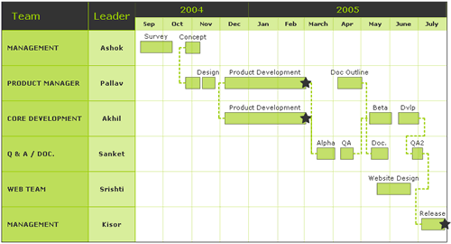
Each <categories> element helps you define a date range on the top of the chart. Like, in our above chart, we had two rows of date range - the first row showed the years 2004 and 2005, and the second row showed the month wise breakdown of each year.
It is compulsory to have atleast one <categories> element on the chart, as that defines the starting and ending date of the chart. The value which you put as startDate and endDate under the first <categories> element is deemed to be the date span of the chart. The <categories> element can have the following attributes:
- bgColor='Hex Color': Defines the background color for the same.
- bgAlpha='Numeric Value 0-100': Define the background transparency level for the same.
- font='Font Face': Defines the font face in which text will be rendered.
- fontSize='Numeric Value': Defines the font size in which text will be rendered.
- fontColor='Hex Color': Defines the color in which text will be rendered.
- isBold='1/0': Sets whether the text will be shown as bold or not.
- isUnderLine='1/0': Sets whether the text will be shown as underline.
- verticalPadding='Numeric Value': Specifies the top margin.
- align='left/center/right': Specifies the horizontal alignment of text.
- vAlign='left/center/right': Specifies the vertical alignment of text.
Basically, you specify the attributes of <categories> element, so that all the <category> element within that particular <categories> element can acquire these values, if not individually specified for each of them. For example, you can set the font properties for an entire date range (vertical row of date). Then, you would not have to define the font property for each part of date (like for each month). It will automatically take the values assigned for that <categories>.
Let's now see the actual elements which help us set the date ranges - <category> element.
<category start='1/9/2004' end='31/12/2004' name='2004' />
<category start='1/1/2005' end='31/7/2005' name='2005' />
</categories>
In the above example, considering it as the first <categories> element of the chart, we've defined the chart's date range from 1/9/2004 to 31/7/2005 (dates in dd/mm/yyyy format). To do so, we've used two <category> elements and specified their individual date range and the name to be displayed on the top of the chart.
Similarly, if we wanted to show more detailed break-up of dates, we would introduce a new <categories> element with it's children as under:
<category start='1/9/2004' end='30/9/2004' name='Sep' />
<category start='1/10/2004' end='31/10/2004' name='Oct' />
<category start='1/11/2004' end='30/11/2004' name='Nov' />
<category start='1/12/2004' end='31/12/2004' name='Dec' />
<category start='1/1/2005' end='31/1/2005' name='Jan' />
<category start='1/2/2005' end='28/2/2005' name='Feb' />
<category start='1/3/2005' end='31/3/2005' name='March' />
<category start='1/4/2005' end='30/4/2005' name='Apr' />
<category start='1/5/2005' end='31/5/2005' name='May' />
<category start='1/6/2005' end='30/6/2005' name='June' />
<category start='1/7/2005' end='31/7/2005' name='July' />
</categories>
As you can see in the code above, we're breaking down the dates into smaller values for display on the chart.
Let's quickly skim through the attributes of the <category> element:
- start='Date': Specifies the start date of that date range.
- end='Date': Specified the end date of the date range.
- name='String Name': Specifies the name of the date range, that actually appears on the chart.
- link='URL Encoded link': If you want the date range name on the chart to behave as a hyperlink, you can specify the URL Encoded link here.
- bgColor='Hex Color': Defines the background color for the same.
- bgAlpha='Numeric Value 0-100': Define the background transparency level for the same.
- font='Font Face': Defines the font face in which text will be rendered.
- fontSize='Numeric Value': Defines the font size in which text will be rendered.
- fontColor='Hex Color': Defines the color in which text will be rendered.
- isBold='1/0': Sets whether the text will be shown as bold or not.
- isUnderLine='1/0': Sets whether the text will be shown as underline.
- verticalPadding='Numeric Value': Specifies the top margin.
- align='left/center/right': Specifies the horizontal alignment of text.
- vAlign='left/center/right': Specifies the vertical alignment of text.
Let's now move to <processes> element, which help us define the processes on the chart.
The <processes> element and its children help us define the list of processes on the chart. Each Gantt chart depicts a list of processes - you can specify all of them and configure their visual properties using this element and its attributes. The following attributes are supported by the <processes> element:
- headerText='String': This attribute helps you set the caption for the processes, that would appear in the 1st row of data table. For instance, in our chart, we've the header of processes set as "Leader".
- bgColor='Hex Color': Defines the background color for the same.
- bgAlpha='Numeric Value 0-100': Define the background transparency level for the same.
- font='Font Face': Defines the font face in which text will be rendered.
- fontSize='Numeric Value': Defines the font size in which text will be rendered.
- fontColor='Hex Color': Defines the color in which text will be rendered.
- isBold='1/0': Sets whether the text will be shown as bold or not.
- isUnderLine='1/0': Sets whether the text will be shown as underline.
- verticalPadding='Numeric Value': Specifies the top margin.
- align='left/center/right': Specifies the horizontal alignment of text.
- vAlign='left/center/right': Specifies the vertical alignment of text.
- headerFont='Font': Defines the font for the header.
- headerFontSize='Size': Defines the font size for the header.
- headerFontColor='Color': Defines the font color for the header.
- headerIsBold='1/0': Sets whether the header is bold or not.
- headerIsUnderline='1/0': Sets whether the header will appear with an underline.
- headerAlign='left/center/right': Sets the horizontal align position of the header.
- headerVAlign='left/center/right': Sets the vertical align position of the header.
- headerBgColor='Color': Sets the background color of header cell.
- headerBgAlpha='Numeric Value': Sets the background alpha of header cell.
- width='Number': This is an optional value, using which you can set the exact width (in pixels) of the processes column in the data table.
- positionInGrid='Left/Right': This option lets you set whether the process column will appear as the right most column of the data table or left most.
Like <categories>, the motive behind specifying attributes for <processes> element is to convey these properties to all the <process> element contained within this element.
The <process> element can have the following attributes:
- name='Display Name': This attribute sets the name of the process, which will be displayed on the chart.
- id='Alphanumeric Id': Each process needs to have an ID specified by you. Based on this id, the tasks related to this process will be plotted against it.
- link='URL Encoded link': If you wish to hyperlink each process name on the chart, you can use this attribute to specify the link for each process name.
- font='Font Face': Defines the font face in which text will be rendered.
- fontSize='Numeric Value': Defines the font size in which text will be rendered.
- fontColor='Hex Color': Defines the color in which text will be rendered.
- isBold='1/0': Sets whether the text will be shown as bold or not.
- isUnderLine='1/0': Sets whether the text will be shown as underline.
- verticalPadding='Numeric Value': Specifies the top margin.
- align='left/center/right': Specifies the horizontal alignment of text.
- vAlign='left/center/right': Specifies the vertical alignment of text.
With this much in place, let's now see how we can specify more information alongside the process names, in the form of a data table.
Each Gantt chart can have one data table, which can show tabular information along side the process names. The table will have as many rows as the number of processes that you've specified in the XML. The number of columns of this table can be defined by you.
To create a data table, you use the <dataTable> element as under:
This element can have the following attributes:
- bgColor='Hex Color': Defines the background color for the same.
- bgAlpha='Numeric Value 0-100': Define the background transparency level for the same.
- font='Font Face': Defines the font face in which text will be rendered.
- fontSize='Numeric Value': Defines the font size in which text will be rendered.
- fontColor='Hex Color': Defines the color in which text will be rendered.
- isBold='1/0': Sets whether the text will be shown as bold or not.
- isUnderLine='1/0': Sets whether the text will be shown as underline.
- verticalPadding='Numeric Value': Specifies the top margin.
- align='left/center/right': Specifies the horizontal alignment of text.
- vAlign='left/center/right': Specifies the vertical alignment of text.
- headerFont='Font': Defines the font for the header.
- headerFontSize='Size': Defines the font size for the header.
- headerFontColor='Color': Defines the font color for the header.
- headerIsBold='1/0': Sets whether the header is bold or not.
- headerIsUnderline='1/0': Sets whether the header will appear with an underline.
- headerAlign='left/center/right': Sets the horizontal align position of the header.
- headerVAlign='left/center/right': Sets the vertical align position of the header.
- headerBgColor='Color': Sets the background color of header cell.
- headerBgAlpha='Numeric Value': Sets the background alpha of header cell.
To define a column inside this data table, we use the <datacolumn> element as under:
The <dataColumn> element can have the following attributes:
- width='Numerical Value': This is an optional attribute which lets you specify the width for a particular data column, in pixels. However, if you don't specify this, FusionCharts will automatically set it to the best value.
- bgColor='Hex Color': Defines the background color for the same.
- bgAlpha='Numeric Value 0-100': Define the background transparency level for the same.
- font='Font Face': Defines the font face in which text will be rendered.
- fontSize='Numeric Value': Defines the font size in which text will be rendered.
- fontColor='Hex Color': Defines the color in which text will be rendered.
- isBold='1/0': Sets whether the text will be shown as bold or not.
- isUnderLine='1/0': Sets whether the text will be shown as underline.
- verticalPadding='Numeric Value': Specifies the top margin.
- align='left/center/right': Specifies the horizontal alignment of text.
- vAlign='left/center/right': Specifies the vertical alignment of text.
- headerText='Label': This attribute sets the display label of the header for that column.
- headerLink='URL Encoded Link': If you need to specify a link for the header, you can use this attribute to specify.
- headerFont='Font': Defines the font for the header.
- headerFontSize='Size': Defines the font size for the header.
- headerFontColor='Color': Defines the font color for the header.
- headerIsBold='1/0': Sets whether the header is bold or not.
- headerIsUnderline='1/0': Sets whether the header will appear with an underline.
- headerAlign='left/center/right': Sets the horizontal align position of the header.
- headerVAlign='left/center/right': Sets the vertical align position of the header.
- headerBgColor='Color': Sets the background color of header cell.
- headerBgAlpha='Numeric Value': Sets the background alpha of header cell.
Now, inside each data column, to represent a row of text, you use the <text> element as under:
<dataColumn headerbgColor='333333' width='150' headerfontSize='16' headerAlign='left' >
<text label=' MANAGEMENT' />
<text label=' PRODUCT MANAGER' />
<text label=' CORE DEVELOPMENT' />
<text label=' Q & A / DOC.' />
<text label=' WEB TEAM' />
<text label=' MANAGEMENT' />
</dataColumn>
</dataTable>
The <text> element can have the following attributes:
- label='URL Encoded String label': This attribute sets the value that would be displayed in the chart, as the contents of that specific cell.
- link='URL Encoded link': If you need to hyperlink the content of the cell, you can use this attribute to specify the link.
- bgColor='Hex Color': Defines the background color for the same.
- bgAlpha='Numeric Value 0-100': Define the background transparency level for the same.
- font='Font Face': Defines the font face in which text will be rendered.
- fontSize='Numeric Value': Defines the font size in which text will be rendered.
- fontColor='Hex Color': Defines the color in which text will be rendered.
- isBold='1/0': Sets whether the text will be shown as bold or not.
- isUnderLine='1/0': Sets whether the text will be shown as underline.
- align='left/center/right': Specifies the horizontal alignment of text.
- vAlign='left/center/right': Specifies the vertical alignment of text.
Now that we're done with data table too, we next move on to specify the main portion of the data - the data related to task bars.
The <tasks> element is used to group all the tasks that are to be depicted on the chart. This element can have the following attributes:
- font='Font Face': Defines the font face in which text will be rendered.
- fontSize='Numeric Value': Defines the font size in which text will be rendered.
- fontColor='Hex Color': Defines the color in which text will be rendered.
- color='Hex Color': This attribute helps you define the background color for the task bar. If you need to show a gradiented background, just specify the list of colors here using a comma.
- alpha='Numeric Value': This attribute helps you specify the transparency of the task bar.
- showBorder='1/0': This attribute lets you specify whether a border would appear around the task bar.
- borderColor='Hex Color': Color of the task bar border.
- borderThickness='Numeric Value': Thickness of the task bar border.
- showTaskNames='1/0': Configuration whether to show the names of the tasks over the task bars.
- showTaskStartDate='1/0': Configuration whether to show the start dates of the tasks on the left of task bars.
- showTaskEndDate='1/0': Configuration whether to show the end dates of the tasks on the right side of the task bars.
Now, to define each individual task, you need to create a <task> element for each task, as under:
<tasks>
<task name='Survey'
hoverText='Market Survey' processId='1' start='7/9/2004' end='10/10/2004'
id='Srvy' color='99cc00' alpha='60' topPadding='19' />
<task name='Concept'
hoverText= 'Develop Concept for Product' processId='1' start='25/10/2004'
end='9/11/2004' id='Cpt1' color='99cc00' alpha='60' />
.... More tasks ....
</tasks>
The <task> element can have the following attributes:
- start='Date': This attribute sets the start date for this particular task. This attribute is compulsory.
- end='Date': This attribute sets the end date for this particular task. This attribute is compulsory.
- processId='Process Id': Each task needs to belong a process, as we had earlier indicated. For this attribute, you need to specify the process id, against which you want to plot this task. Process id was earlier assigned by you in the <process> element. You need to duplicate that same id here.
- Id='Alphanumeric Value': Each task needs to have a id, so that it can be easily referenced back in XML. You can set the id of the task using this attribute.
- name='String Name': This attributes sets the name of the task, which will be displayed on the chart.
- hoverText='hover caption text': If you want to display more information as the tool tip of this task bar, you can specify that hover text here.
- link='URL Encoded link': If you intend to provide a hyper link for the task bar, you can set the link in this attribute.
- animation='1/0': This attribute lets you set whether this particular task bar would animate or not.
- font='Font Face': Defines the font face in which text will be rendered.
- fontSize='Numeric Value': Defines the font size in which text will be rendered.
- fontColor='Hex Color': Defines the color in which text will be rendered.
- color='Hex Color': This attribute helps you define the background color for the task bar. If you need to show a gradiented background, just specify the list of colors here using a comma.
- alpha='Numeric Value': This attribute helps you specify the transparency of the task bar.
- showBorder='1/0': This attribute lets you specify whether a border would appear around the task bar.
- borderColor='Hex Color': Color of the task bar border.
- borderThickness='Numeric Value': Thickness of the task bar border.
- borderAlpha='Numeric Value 0-100': Alpha of the task bar border.
- showName='1/0': Configuration whether to show the name of this tasks over the task bar.
- showStartDate='1/0': Configuration whether to show the start date of this task on the left of task bar.
- showEndDate='1/0': Configuration whether to show the end date of this task on the right side of the task bar.
- height='Numeric Value': If you intend to specify an explicit height for the task bar, you can do so using this attribute. Otherwise, FusionCharts automatically calculates the best possible value.
- topPadding='Numeric Value': If you intend to specify an explicit top padding for the task bar, you can do so using this attribute. Otherwise, FusionCharts automatically calculates the best possible value.
- taskDatePadding='Numeric Value': If you intend to specify an explicit distance between task bar and date textbox, you can do so using this attribute. Otherwise, FusionCharts automatically calculates the best possible value.
And this should be enough to plot all your task bars on the chart. We'll next see how to render milestones on the Gantt chart.
<milestone date='29/7/2005' taskId='Rls' radius='10' color='333333' shape='Star' numSides='5' borderThickness='1'/>
<milestone date='2/3/2005' taskId='PD1' radius='10' color='333333' shape='Star' numSides='5' borderThickness='1' />
<milestone date='2/3/2005' taskId='PD2' radius='10' color='333333' shape='Star' numSides='5' borderThickness='1'/>
</milestones>
The <mileStone> element can have the following attributes:
- date='Date': Date where you want the milestone to be placed.
- taskId='Task Id': The id of the task over whose bar you want the milestone to be placed.
- shape = 'star/polygon': Shape of the milestone.
- numSides='Numeric Value 3-x': Number of sides that the milestone would have. For example, for a diamond, you can set shape to star and then set this value to 4.
- startAngle='Angle': Starting angle of the polygon/star drawn as milestone.
- radius='Numeric value': Radius of the polygon/star drawn as milestone.
- borderColor='Hex Color': Border color of the milestone.
- borderThickness='Numeric Value': Border thickness of the milestone.
- color='Hex Color': Background fill color of the milestone.
- alpha='Numeric Value 0-100': Transparency level of the milestone.
Let's now look at the trendlines option that the Gantt chart offers.
<line start='28/6/2005' displayValue='Today' color='666666' isTrendZone='1' alpha='20' />
<line start='13/6/2005' end='23/6/2005' displayValue='Under Monitor' color='FF5904' alpha='5' isTrendZone='1' />
</trendlines>
The <lines> element can have the following attributes:
- start='Date': Start date for the trend zone.
- end='Date': End date for the trend zone. If you intend to draw a trend line instead of a trend zone, then you do not need to specify a value for this attribute.
- displayValue='String Value': If you want to display your custom value beneath the trend line, you can do so here. Example, you can show the trend line and label it as "Today".
- color='Hex Color': Color of the trend line.
- thickness='Numeric Value': Thickness (in pixels) of the trend line.
- alpha='Numeric Value 0-100': Transparency level of the trend line/zone.
- isTrendZone='1/0': Option to set whether it will appear as a trend zone or a trend line.
And with this, we move over to the last item supported by the Gantt Chart - connectors.
Task connectors are used to connect various task bars on the chart, to indicate the flow of process. Like, using task connectors, we can show the dependency of one task over another, or the general flow of the entire set of tasks.
To create connectors on the chart, we use the <connectors> and <connector> element as under:
<connector fromTaskId='Cpt1' toTaskId='Cpt2' color='99cc00' thickness='2' fromTaskConnectStart='1'/>
<connector fromTaskId='PD1' toTaskId='PD2' color='99cc00' thickness='2' fromTaskConnectStart='1'/>
<connector fromTaskId='PD1' toTaskId='alpha' color='99cc00' thickness='2' />
<connector fromTaskId='PD2' toTaskId='alpha' color='99cc00' thickness='2' />
<connector fromTaskId='DocOut' toTaskId='Doc' color='99cc00' thickness='2' />
<connector fromTaskId='QA1' toTaskId='beta' color='99cc00' thickness='2' />
<connector fromTaskId='Dvlp' toTaskId='QA2' color='99cc00' thickness='2' />
<connector fromTaskId='QA2' toTaskId='Rls' color='99cc00' thickness='2' />
</connectors>
The <connectors> element can have the following attributes (which applies to all connectors, unless otherwise specified for each connector individually):
- Color='Hex Code': Color of the connector
- Thickness='Numeric Value': Thickness of the connector line in pixels.
- Alpha='Numeric Value 0-100': Tranparency of the connector line.
- isDashed='1/0': Configuration whether the connector line will appear as dashed/solid line.
And for each connector, you can specify the following attributes:
- fromTaskId='Task Id': Id of the task (which you had earlier specified as an attribute of <task> element) from where the connector will originate.
- toTaskId='Task Id': Id of the task (which you had earlier specified as an attribute of <task> element) from where the connector will terminate.
- fromTaskConnectStart='1/0': Configuration whether the connector will join the originating task bar at the start position or end position.
- toTaskConnectStart='1/0': Configuration whether the connector will join the terminating task bar at the start position or end position.
- Color='Hex Code': Color of the connector.
- Thickness='Numeric Value': Thickness of the connector line in pixels.
- Alpha='Numeric Value 0-100': Tranparency of the connector line.
- isDashed='1/0': Configuration whether the connector line will appear as dashed/solid line.